Layers With Simple HTML: Real Background InfoBODY bgcolor="..."The Background Color of a web page is often the very first imagery that is displayed to the average web surfer. Choice of a background color is of high import because it sets the tone of the user's experience. If you decide not to set a background color, you often end up with one of three colors displayed for you: white, grey or black. White is the default page color for Internet Explorer. Grey is used by Netscape. Setting a particular color is important, even if it's just setting it to white (#FFFFFF), because you shouldn't assume the background color will be the same as the color of your own favorite browser. Because the background color is set by a small bit of text at the top of HTML files, browsers will display that color quickly. When a web page has a background image, the browser has to make a second request (hit) on the web server in order to download that background image. The time that it takes to make this second round trip can be milliseconds for high-speed connections or 5 seconds or more for consumer modem connections. In an age of high-speed imagery, 5 seconds can be an eternity. If you have a complex background image, set a background color that supports that image. In the mean time, the browser background color is either the browser's default or your selection.
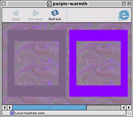
To choose the background color for the sample above, I took the background image into Photoshop and ran a Guassian Blur on it 4 or 5 times until the image became a smooth color. I then used the offset command to wrap around the edges of the tile into the center of the image. I ran the Guassian Blur a few more times and came out with a single solid color. I then used the RGB value of that color to set the background color the page. Now that the background color is set, we can move up one layer to the background image. BODY background="..."The first question to ask is 'Do I need a background image?' There's a tendency to simply use a background image out of habit. Whether it's a small square tile, a long vertically oriented tile or a larger background image, sometimes it's better to simply use a background color as we set above. If the reason an image is being set is simply to add a solid color or a 'texture' consider dropping it altogether. If you decide that your vision cannot be fulfilled by anyother means, then use a background image, but use it wisely. Now let's take each of the background image types in order. Small squares Smaller highly patterned images like the one used in the sample above were very common when the background attribute for the body tag was introduced by Netscape. They often range in sizes of 20 x 20 pixels on up to 200 x 200 pixels. Subtlety notwithstanding, the majority of these tiles are garish, and lacking any real value for the design of most web pages. However, this type of background image was the first to be used widely. They have a direct lineage to the background tiles and desktop patterns that most graphical UI's have had since the late 80's. Long vertical tiling images and Tall horizontal tiling images The first follow on to the standard square tiles was a refinement that used the repetition of the tiles for a new purpose: to provide a margin. These tiles are usually quite thin somewhere along the lines of 8 x 800. If you plan on using this type of image, at least keep the smallest dimension larger than 8 pixels. On older machines, some browsers actually end up filling up the background of the page by drawing the background image over and over again. This can lead to unbearable pauses each time the window is scrolled the slightest bit. Tiny squares On occasion you run across a control freak of a web designer who will go so far as to make a background image of a color that could just as easily be created with a regular RGB hex code. These small graphics that are usually 10 x 10 pixels or less are worthless and should be avoided. This type of image also causes the same pausing problem as above, except the length of the pause is squared! Large backgrounds Finally we come to really large backgrounds. These types of images are usually huge. The designer is often attempting to create an image that will fill the browser window. That's great until it hits the real world and users have their browser windows open much wider or much narrower than the designer's. Then the image's dimensions have no connection to the window. That's not to say that background images can't be used. At Bad-Seed.org I use large JPEGs of the artist to create a background for the site. However there were a few details that I took care of as well. 1) The image tiles well both vertically and horizontally. I specifically made sure that the transition between the bottom of the graphic to the top of the graphic was smooth and didn't attract attention to itself. 2) I made sure that the image was 'supporting' the visuals of the page, rather than *being* the visuals for the page. This way, if a user's browser doesn't show the full image, nothing is lost in regards to the content of the site. 3) I massively compressed the JPEG. Even though they are upwards of 800 x 800 pixels, the files are often between 9 and 15 KB each. Your average JPEG at that size would hit somewhere between 100 and 400 KB. Looking at the images on their own, they are mottled and heavily obscured by the digital artifacts of the JPEG compression scheme. But when viewed in the context of the site, these blemishes are of no consequence because the image is not the focus of the page. 4) The images have no dynamic range. If you think of the values of grey stretching from 0 (black) to 100 (white), most black and white images use the range of values from 0 to 100. But I used a much smaller range of values, usually between 90 and 100. I set this using the Levels control in Photoshop. This very small range of values actually makes JPEG file compression more effective. Now that we've got the background images down, we can look at the next layer up: The Table Tags. Article Contents: |
Content © 1997–2005 Ross Olson
CSS Layout © 1998–2002 A List Apart